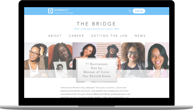
The Bridge is a blog about inclusion and diversity, by the creators of Divercity.io
VIEW PROTOTYPE
THE SITUATION
The team at Divercity.io wants to make it easy for people with diverse backgrounds to connect with each other and with recruiters. Beyond creating a safe space for these connections on the Divercity professional networking platform, they sought to create awareness and educate their users, while at the same time driving new traffic to their platform.
MY TAKE
I saw an opportunity to create a blog focused on diversity news and content for job seekers and professionals. Our goal would be to make users feel heard as to the issues plaguing underrepresented groups and allow them to connect and sympathize with others. The blog would champion the cause of growing diversity in the workplace, be the voice of Divercity.io, and drive engaged users to the Divercity community.
MY ROLE
UX Design
UI Design
DELIVERABLES
Competitive analysis
User research
User stories
User flows
Wireframes
Usability testing
HiFi prototype
User testing
TOOLS
Sketch
InVision
Let's take a look at how we got there
1
COMPETITIVE ANALYSIS
My work began with research: first into professional blogs and then more narrowly into the subset of professional blogs targeting specific groups. Two competitors rose to the top of my consideration set based on the consistency of quality content targeted at Women, Blacks, Latinx, and Native Americans: FairyGodBoss and Jopwell's The Well.

From an analysis of each blog, 6 key strengths emerged.
 |
||
|---|---|---|
| Original content organized by category |  |
|
| Option to subscribe to email list | |
|
| Regularly updated content |  |
|
| Uninterrupted article reading view | |
|
| Estimated article reading times | |
|
| Option to engage with content and community through comments | |
|
SWOT Analysis
2
USER RESEARCH
With an understanding of the blog features prioritized by our competitors, I next looked to understand the needs of our target audience. As prior user interviews and usability tests had been conducted on the broader Divercity app user base, I was able to reference this research and consolidate findings valuable for defining my target blog reader.
I learned that the Divercity user base includes students and professionals from underrepresented groups looking to start or accelerate careers in technology. They are looking for a safe space to communicate about companies hiring for their desired roles, specific opportunities and best practices for growing their careers as minority groups.
I then interviewed a subset of users to understand the type of content they seek to support these needs. This research would help define the content categories supported by the new Divercity blog.
-
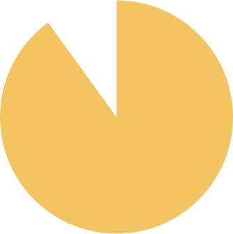 90%
90%seek resume-writing and interviewing advice
-
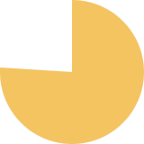 76%
76%seek advice on pursuing promotions and salary negotiation
-
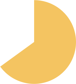 65%
65%seek news and insights on addressing the need for diversity and inclusion
4
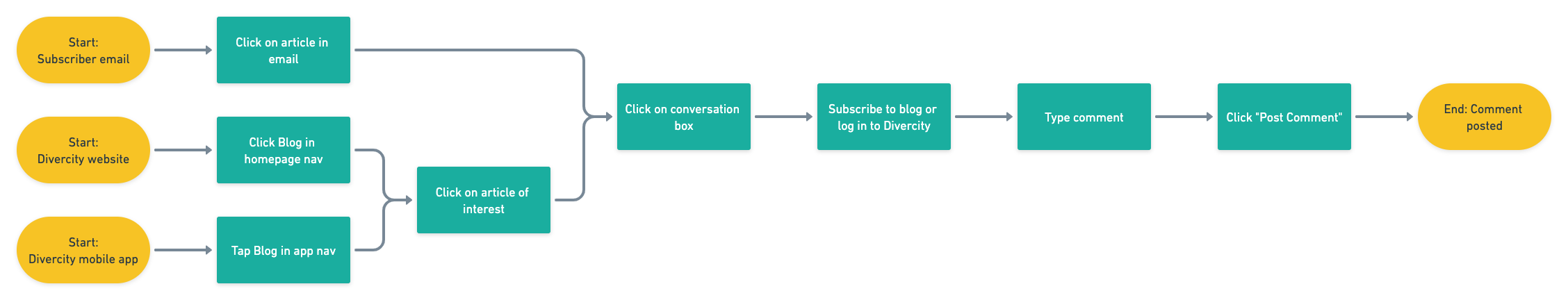
USER FLOWS
Next, I categorized my user stories into user flows. While many borrowed from flows familiar to any blog reader, the commenting flow was the subject of much debate for our design team. With additional research and testing, we decided to reserve commenting for the Divercity community members, and required a login prior to leaving a comment. Our goal was to ensure that comments were left by engaged members of the community, and to offer an incentive to our existing Divercity users to engage with blog content.
ALL FLOWS
5
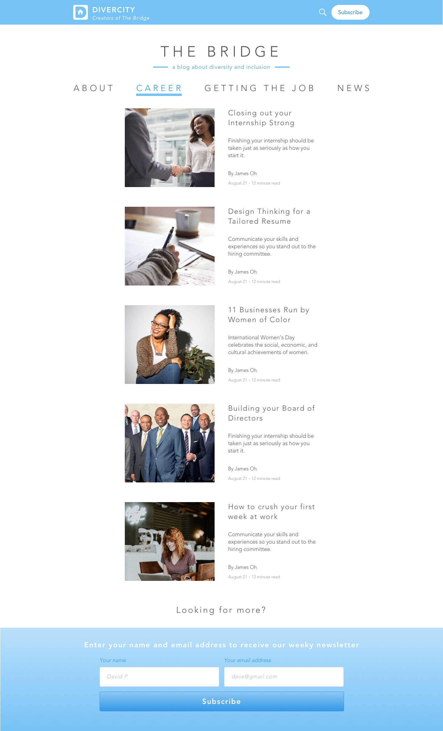
WIREFRAMES
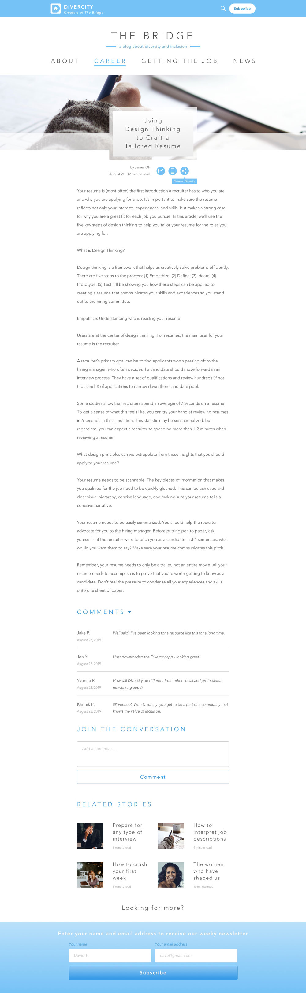
After collecting feedback on my user flows, I used them to identify each screen that would be required to complete each task. I then sketched a few potential designs for main screens like the blog homepage, content category pages and articles. My sketches allowed me to quickly prioritize my design concepts and translate my top choices to wireframes in Sketch. To get feedback on these wireframes, I built a low-fidelity prototype in InVision and began usability testing with real users.


TAKE-AWAYS
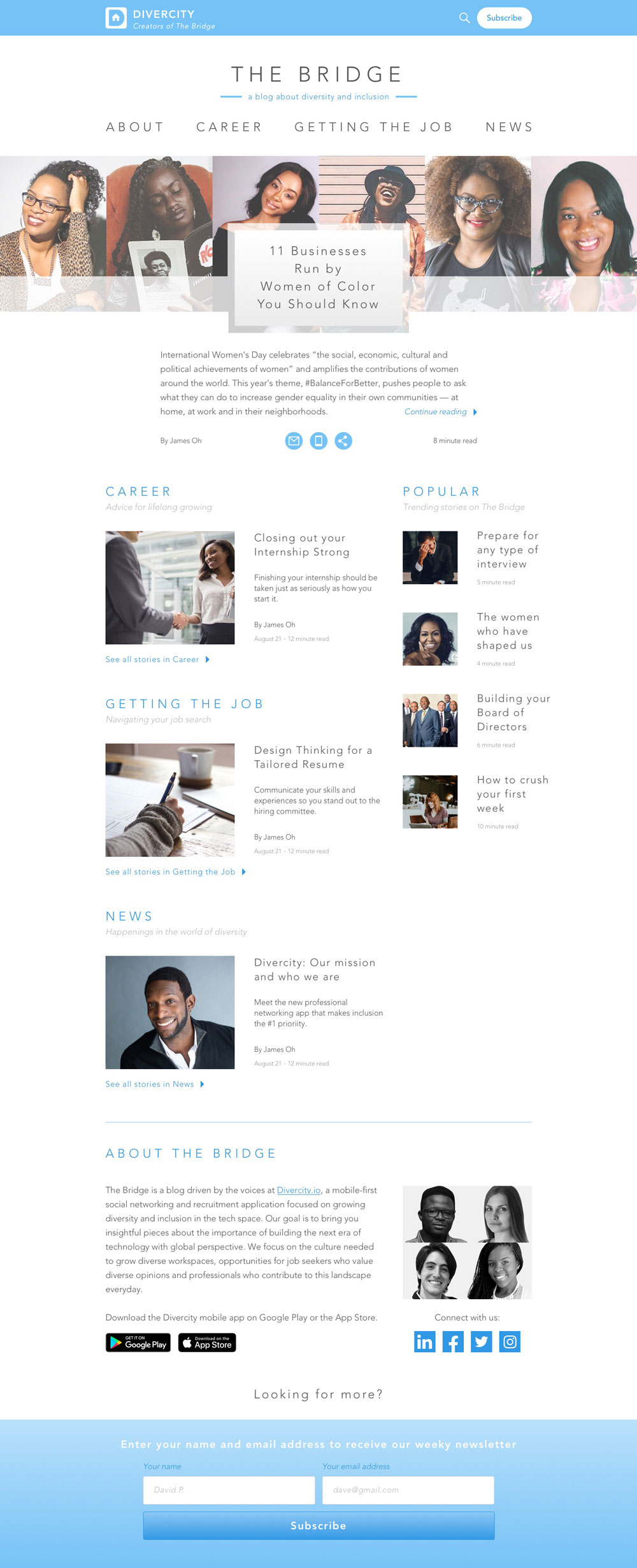
When users initially landed on the blog homepage, they were unsure what type of website they were viewing. To remove any ambiguity, I added a tagline under the blog name and short descriptors to each section.
Many questions about the nature of the site were clarified when users reached the “About” section, but as this section fell at the bottom of the site, they had to scroll to get to this understanding. To shortcut this process, I added a link to the About section in the top navigation.
Users found article sharing options, especially the one custom to Divercity, difficult to recognize. To remedy this, I updated the sharing buttons to reflect familiar icons and added descriptive tooltips that appeared on hover.
ALL WIREFRAMES
6
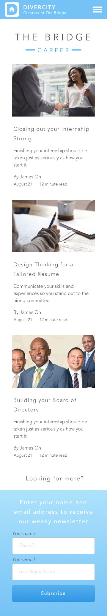
HIGH-FIDELITY PROTOTYPE
Once I had incorporated all of the feedback from my usability testing into my wireframes, I was ready to apply the existing Divercity branding to the blog wireframes and bring them to life in a high-fidelity prototype. I took this prototype back to my users for another round of testing.


TAKE-AWAYS
Full-scale, high-fidelity photos and graphics called attention to the fact that a portion of the main article hero and headline frequently fell below the fold for narrower screens. I updated the length of the hero image and headline to ensure it could be fully viewed and read before scrolling.
Users identified some text as difficult to read, so I updated all text to ensure the background-foreground contrast ratio passed all accessibility tests.
VIEW PROTOTYPE
WRAPPING IT ALL UP
Transitioning my design work on the Divercity blog to my developers was a proud moment. I had worked hard with my team to anticipate all the details, and was excited to see it all go live. Even in this transition, however, I learned that my work was not done. I discovered that we would need to build the content management system to support the blog - and our development team was not interested in leveraging an existing CMS framework like Wordpress. To keep from losing any additional time on our launch, I expedited my research and design process to deliver a content editor that would allow our content strategist to manage the blog independently going forward. Lesson learned: in the future, I will thoroughly define all potential stories for admins and ensure my developers have a clear path to testing and executing these stories.
I was also proud to have played a role in defining the voice and experience of a brand that offers a place for honest communication about the value of diversity. Working with the international team at Divercity made it clear that design absolutely benefits from a variety of perspectives. Whether in user research or design teams, diversity of opinions and experiences inevitably makes us smarter, and our products more inclusive.
Ready for another?
-

Spil Cloud Storage
Product Design + Branding
Learn more
-

goBus Transit
Product Design + Branding
Learn more